The Eclipse project, providing a powerful IDE editor, has a smart download page that detects what kind of platform you are on related to that suggests you download page. The only problem is that in the process they fail to clearly communicate download links.
Screenshot with important areas highlighted is as such:
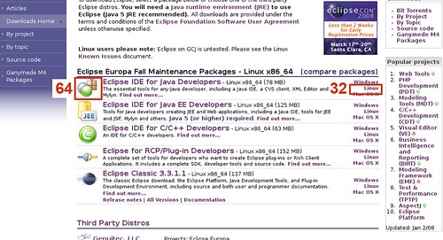
What happened here is they while they know that you probably want Linux Intel 64-bit they hide it under icon on left (red squares are mine). They also kindly provide Linux download on right, which actually takes you to 32-bit version.
In order for Eclipse project to make the download page nicer they should:
- provide clear-text download links below the description text in following form:
- Download Linux x86-64 (150Mb) (tar.gz)
- Other Linux versions
- the “other linux versions” page should tell you how to know which version you should download
- remove the download link from the icon, it does not help to have arbitrary piece of graphic be a download link
- optionally provide a big link somewhere with “confused? Get explanation here” for people who are not comfortable on linux yet.
If you want to look at this problem through traditional usability review perspective you could say it has problems with affordances (strange graphic for download link) and not presenting clearly knowledge in the world (you have to mouseover the link to see what you’ll get to download) together with clearly opposing download links.
Someone kindly opened this bug to track the request:
https://bugs.eclipse.org/bugs/show_bug.cgi?id=218081