Videos from TED are something of incredible nature. Each being about 20 minutes long, also perfect to watch while traveling, especially on the plane when 20 minutes is just about right before flight attendants starts serving something or turbulence happens. I’m usually doing this while multitasking on a number of other pre-trip issues, yet for some reason the process was frustrating me, so I decided to investigate why it was so hard to download a few files.
Sample of two of their pages look like this:
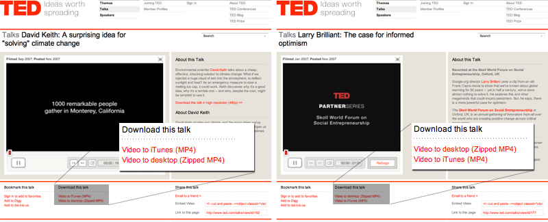
Closer observation reveals the fact that the order of download links actually changes. On first page download to iTunes is the first option, while on second it is second. This minor change actually confused me quite a bit. Cognitive reasoning goes along the path:
- On the first video page, find the download link
- Initiate download process
- Return to video menu and select another video
- On second video page, move the cursor to the same spot as in first video menu (second option)
- Right before clicking, realize on a subtle level that the option is not as expected
- Breakdown
After the breakdown, user has to start reading the contents of the page once again, in order to figure out where the actual download link is. Even though this can be perceived as a minor breakage, it still breaks users flow. Since the flow is already broken the page itself can not mend it easily since when user opens the third page (not pictured), what are the chances for download link as the first option? What about fourth and fifth?
One also has to consider the consequences on clicking on a wrong link, in this case Video to iTunes (MP4). This option actually starts iTunes (if installed) and starts downloading automatically which is not something that user expects, adding greatly to the confusion and lots of click to undo the operation.
Lessons learned
Site in question could greatly optimize their page flow together with ability to easily download files, if the links would be distributed around the site in a consistent ordering.
Do you ever send these thoughts to the page administrators?
I do. They usually promise “to look into it”.