Trying a latest software update is something that every true Apple user does in the morning after the big Apple announcement. So this time it was iTunes 8 with it’s genius button that automatically makes great connected playlist.
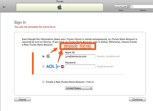
For some reason I was sleepy enough to actually fail at their Genius/iTunes store login form. Whoever designed this probably didn’t realize that the radio buttons seem to indicate that they have text areas next to them and that they are not visually separated enough.
My solution for the problem showed in a screen shot below would be to move the radio buttons on top of the form, or at least make it more visually separated. Without this change, it’s really easy to just assume that the form wants you apple ID, but the second text box is there to enter you AOL ID, if you have one.
The error message is also pretty obscure, just one red arrow next to big AOL logo. Whoever design this, released it much too soon.
![Reblog this post [with Zemanta]](http://img.zemanta.com/reblog_e.png?x-id=d07151b6-a00e-4c1d-85ee-27c8a37f4269)
This *might* just make a bit of sense to a UX Designer at two int he morning. Radio buttons next to the service login you’d like to use, but the error message is pretty strange, I’m sure iTunes has a Password Missing / Email Missing variable which would allow for a specific error message.
I agree. It’s actually pretty surprising how hard is to correctly perceive this form if you’re multi-tasking.
I ran into the exact same problem. Looks like others did too. You can’t ever blame the user for “not getting it”. This is Apple’s fault.
http://blog.hanfordlemoore.com/2008/09/09/itunes-genius-ui-who-designed-this
Ah ha! I did the same thing too. Design revision is in order.
Wow. Thanks. I'm not even sleepy, and wondered why they just wanted a ID.
Thought the pw would be the next screen, but I kept failing.
Can't believe how bad this is!