Creating a good visualization consist of two major parts:
- having a robust visualization technique (wave graph in this example)
- having a good data set that fits to the visualization technique
After I got Graphication working yesterday, I quickly realized that my initial data set doesn’t fit this technique out of the box as it was one stream and not a series of intertwining ones. Looking around, I’ve discovered a perfect one – chatter on Koornk.
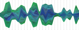
How does it look?

What does it mean?
It’s a Wave Graph visualization of who the person in question is talking to. In good old Twitter fashion, Koornk also uses @ to reference people so you can say: “@jure: foo!” or “I’m drinking coffee with @Miha and @bufo”. In all the cases my script counts nicknames after @ and aggregates them on a weekly basis. For a nickname to be eligible to get on the list you have to mention it at least twice in a week.
Any interesting observations?
Looking at these graphs you can start seeing how easy data mining and importance of protecting you online privacy.
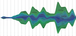
Example of that would be @bufo who’s graph looks like this:

You can easily see that he talks a lot to: @Miha, @Katja, @jure, @Hirkani and a few others. That instantly gives us some information about his online friends and we can assume that since it’s Slovenia that he probably also knows them in person or that they have at least some things in common.
While that doesn’t seem too revealing (at least to their friends) we have to be aware that this information is now available to anyone willing to crawl the web and connect the dots. There should be at least some targeted advertising in this 🙂
Lessons learned
- creating these visualizations is harder then it looks. Mostly because you have to know your data set well to process it correctly.
- it’s CPU intensive. Drawing each of these things takes a good few seconds every time. It’s not a big problem if you’re doing this off-line but there might be an issue of scaling here.
- having a good API to get data from is important. Luckily Koornk API is good and fast.
- OS X is a pain to use pycairo in as it keeps crashing my python. Useful workaround is to have Linux running in a local VMWare and run computing batches there.
- visualization hopefully isn’t a purpose for itself. It’s much more rewarding to teach a community something about itself.
I’ve also generated a gallery of 65 most chatty people on Koornk if you want to look at more of these pictures (or find yourself).
![Reblog this post [with Zemanta]](http://img.zemanta.com/reblog_e.png?x-id=f54ad6d4-7abe-4f9c-a4ef-96a46f21c306)
I appreciate your time invested in this graphs. Very nice and very … meaningful, at least to me 😉 Btw. ever heard of Processing, a visualization programing language?
Great idea, great work, beautifully done.
Also, thanks for visualizing my chatter. =)
I've looked into it briefly a few times but I haven't yet figure it out.
Hopefully there are enough days of old year left to learn it 🙂