Getting a CrackBerry was my latest step in showing total devotion to my employers big ideas about changing they way people blog. Since we use Google Apps for part of our intranet solution I thought it would be nice to integrate this gadget with their servers. Sadly this made my already bad initial experience with the whole BlackBerry platform just worse. Even though they made a number of steps to confuse their users, I’m just going to concentrate on just their web page on Mobile offerings for Google Apps.
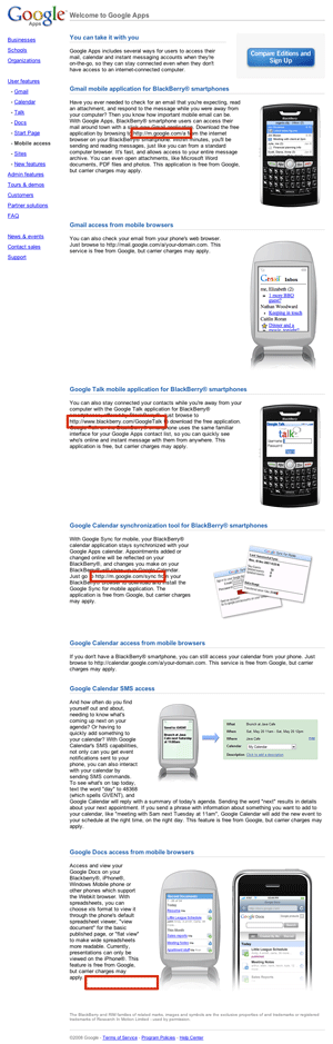
The basic idea of the page is to communicate that their suite offers a wide variety of mobile options of accessing the content. Yet It does this as it was designed as each section was its own page in some mobile providers glossy section.
No hyperlinks
They make hyperlinks to their mobile addresses part of normal text, making it really hard to notice and read. It also makes it impossible for someone to open the page up in their mobile browser and actually click on the links.
Lots of diffrent hyperlinks
The links they want to promote (in between links for non-blackberry users) are:
Even though m.google.com tries to keep it simpe the blackberry address in the middle destroys the message from Google to go to m.google.com with some sort of appendix for the addresses.
Failure to actually include crucial information
One such example is at the bottom where they promote their docs service, yet fail to include address for mobile access. My understanding after playing around a while is that I have to (or at least am able to) download an extra app to have great experience, yet they do not tell me that.
It also seems that their idea of mobile is BlackBerry and then everything else. While I appreciate their thought that they support everything with BlackBerry badge, a developer in me has its doubts. There are also some other very powerful smart-phones and it would be nice to address that issue a bit more clearly. They also do not make clear if they target at everything mobile or just the smart-phones.
Not speaking users language
The last section casually mentions “or other phones supporting WebKit browserâ€. My iPhone has Safari inside, that you very much as other mobile phones had a “Browserâ€, “Mobile Internet Explorer†and such. It is a bit a stretch to expect users to know what rendering engine their mobile device uses.
The same section goes on to mention “xls†format which is probably known to users but naming it Excel spreadsheet (with .xls ending) would make it more clear for the wide variety of users who actually don’t see the endings of their files in Windows.
Not providing simple mobile accessible URL and total failure of consistency
While Google actually offers mobile search at http://m.google.com, the page there actually doesn’t tell you anything about their mobile offerings. In order to get that you have to Google around to find http://mobile.google.com which promotes a downloader for “all†Google products in one go. Which is a nice idea for the fact that the installer actually doesn’t offer GTalk client.
But all of this is besides the point as this information is not on the page which actually forces users to go back at browsing the inter-webs to stumble on this information somewhere.
What could they do to improve the page?
- Provide a clear, nice URL on top with all the links or even better – make their installer at that page actually able to install all of their offerings.
- Separate the BlackBerry page from other mobile offerings. It seems sensible to have different pitches for Blackberry, iPhone and other mobile users.
- Make the URL’s stand out and normal hyperlinks so it is not that hard to notice them.
- Make some line breaks so the text on the page is actually readable.
Conclusion
The page itself feels like it was written in some marketing department, without any actual purpose to be helpful for any existing users that located it through search in hopes that it will tell them how to actually mobile stuff. This is also the message of this blog post:
People will find your marketing materials while searching for help on the topic. Design it in a way that it will at least point them into right direction for real help, if not actually help them in using it.

I feel your pain as I had the same problems with Google mobile experience (on top of all the other problems I had to convince SiMobil Vodafone to actually make my BlackBerry working properly).
Now try having multiple email accounts specified with BB BIS and not having it to reply with the wrong one :/ Good luck.
Besides all that, I really love my CrackBerry. 🙂