At the Web 2.0 Expo in Berlin I was given a business card with a special code on it, that one enters into form field at vcrd.net and gets back that persons contacts in a vCard microformat. It is then possible to import this into virtually any Personal Information Management application.
Using their application I could reflect on a concept that too much information is just overwhelming. Here is a screenshot of their entry screen. It is a bit long and asks for a lot of information. While it does make sense to ask for it, I doubt a lot of users will have patience and stamina to fill it out in full.
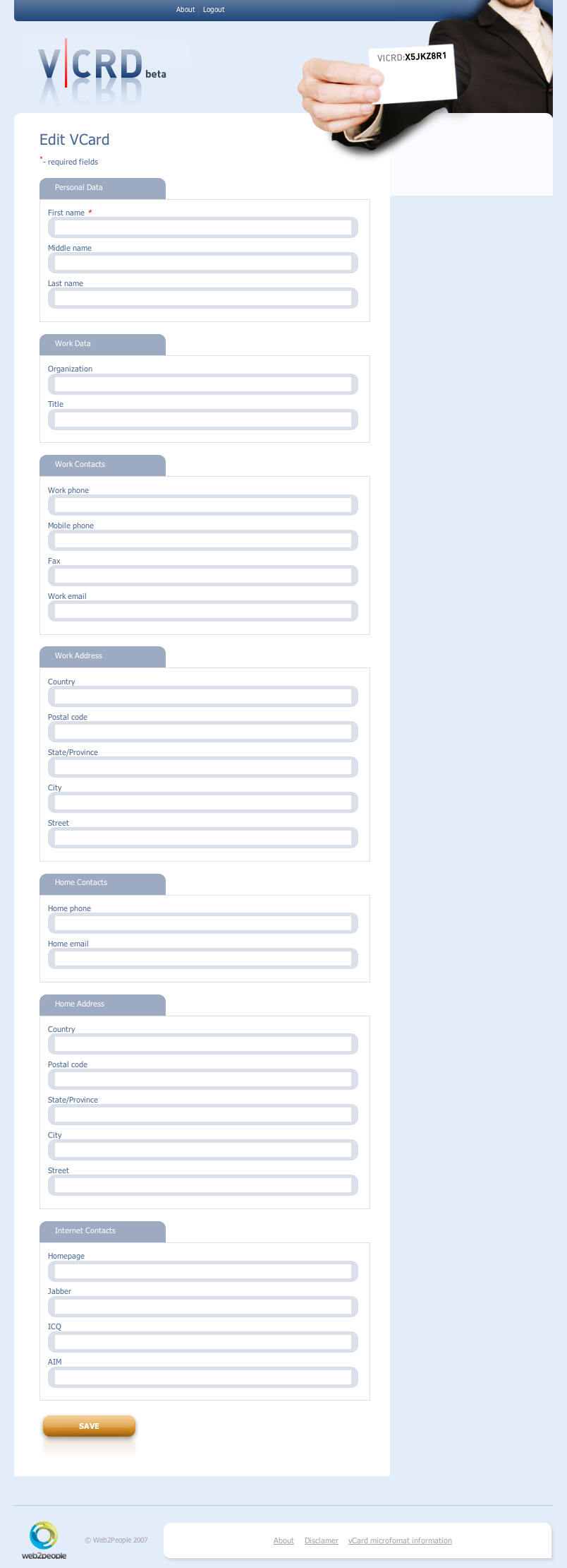
My suggestion in this case would be to use some bit of Web 2.0 magic and involve the concept of shifting divs. Something like the homepage of Coda, where you have one big page but you can use tabs on top to move between them. Here a series of Next/Skip arrows could be presented on bottom with highly recommended graphic element that would allow to go back in time. Save should be done in the background via AJAX callback and also visually presented to user.
Interestingly enough, the site has one quirk. That is, the vCARD displayed in the top right corner of all the pages: X5JKZ8R1, upon entering shows just an error message:
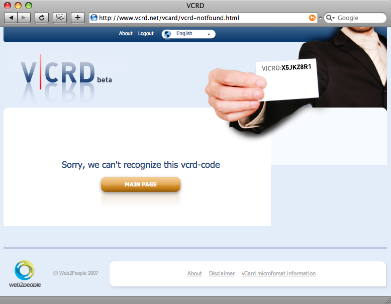
I think it would be nice if upon entering this code, there would be a nice cookie for users efforts. Maybe the site creators personal card with friendly note attached or a special greeting. It would also allow for a random wanderer to test the site experience without actually having to have such a card.
Staying on the topic of retrieving the vCard, there is actually no landing page upon entering the code. You get redirected to actual file that gets downloaded to your computer or a special application tries to claim ownership of it. Having a page with a message that a card download is about to start and a link for manual download would improve the experience. If for some reason user missed the fact that something downloaded in background, there is still a page there with a nice message. It could be also used to suggest to that person to create a card of their own.
Conclusion
While playing with the site I tried not to focus on small things that are just implementation details and can be easily fixed but on the bigger obstacles in order to get larger adoption.
The site would get a big usability boost if it would make the form shorter and easier to enter with addition of more clear download instructions for actual vCard. I’m also wondering why the actual download codes have to be so complicate and why can’t I just have ‘jure.cuhalev’ for a code, but I guess this is part of a bigger site strategy.
i really like the idea of a special greeting i think that would work well