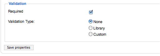
Usability of 3rd party modules is often interesting and you can see evolution of the product through the interface. Breezing Forms is not exception to this, as it uses interesting formation of radio buttons to indicate validation options.
Trick question: what is current setting?

Yep, it’s None. Not Library that it seems from the first glance. Readability of this form can be greatly improved by moving radio button field to the left of text:

The lesson here is that if you’re forms are making you hesitate before clicking, you probably have to rethink them.
Update: D. submitted further improvement in the comments (thanks!):

You could even put Validation type on the left and the options in vertical (and not horizontal).
Still far from perfect.
Great guide: http://msdn.microsoft.com/en-us/library/aa511488(v=MSDN.10).aspx
http://www.shrani.si/f/3z/vR/1kGuo4lb/tmp670.png